- February 13, 2024
- Reading time about 5 minutes
What entices users on the listing management platform?
A visually appealing design, ease of navigation, and clarity!
This is an era of customer-centric solutions. User experience and ease are the top priorities of realtors, and rightly so. While surfing an IDX website for realtors, a user gains experience and ease that later makes or breaks the deal for the realtors.
BidHom is a leading online auction platform that has been truly revolutionizing the way realtors operate their businesses and auctions take place. Besides the powerful features it offers to realtors, it has also brought users to center stage by offering a highly interactive branding solution.
Here’s how the look, feel and ease matter for a listing management platform to succeed:
Look and Feel Matter!
Let’s get it straight—users observe everything about a website and base their decision on how it looks and feels. The purpose of building a real estate brokerage website is to generate business, potentially turning every user into a lead. An IDX website for realtors only does the job right when it has a stellar look and feel.
Aesthetics are important to entice users. A light color theme with dark text and pop-ups catches the eye. The aesthetics, typography, and graphics used also make an impact. Besides, consistency and visual hierarchy also matter. If the flow doesn’t make sense, users are likely to switch to another website that offers more clarity.
When it comes to the feel of a real estate brokerage website, it is how a user experiences the website. What does a customer appreciate when they are out on a hunt for their desired property?
· Easy to navigate website
· Responsiveness
· Quick Loading
· Interactive and immersive experience
· Accessibility
Ease of browsing isn’t only about look and feel. It’s also about clarity and consistency. An IDX website for realtors represents a brand. If the website lacks features like feedback and doesn’t handle errors efficiently, it might turn away users even when the design interface is great.
That said, here are the few user experience touchpoints on the BidHom website that optimize user flow and conversion rates.
Virtual is New Real!
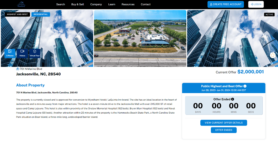
An impressive banner with the right color palette that resonates with the brand image, accompanied by three options to explore a listing, will entice the users to a great extent. Without having to visit the property, potential buyers can take a close look at it through images, videos, and virtual tours. Such convenient options at the top of the page prompt the user to engage with the listing and explore.
The Secret is in the Details!
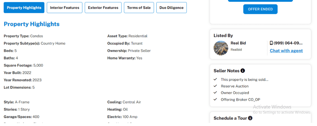
Well-defined property details enhance the probability of a listing getting a better price and a faster closure. Bidhom showcases asset details in a systematic and lucrative manner. The color scheme and content arrangement make it easier to spot relevant details. There are easy-to-navigate information menus with interior and exterior features listed for a better understanding of the listing. With terms of sales and due diligence details at a glance, Bidhom makes decision-making easy and credible.
The Bigger Picture is Always Better!
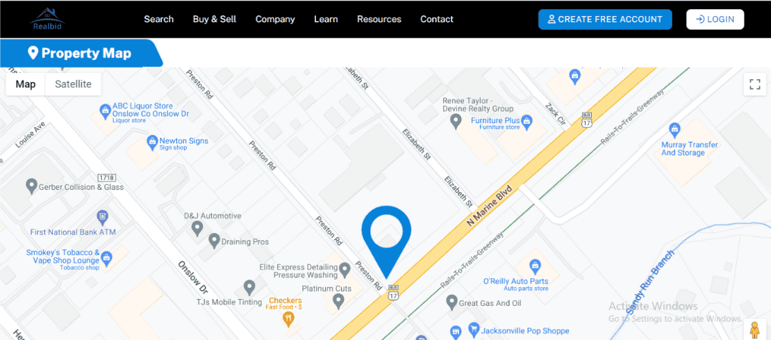
If a potential buyer is on the lookout for a home, they are mostly interested in knowing what the neighborhood and amenities are like. Modern-day buyers want to visualize a property on a map to understand how close the hospital, school, grocery store, and brewery are.
Map view and satellite imagery enhance the user experience in real estate by providing a spatial understanding of property locations. Users can interactively explore listings and toggle between different map layers for various perspectives. Satellite imagery offers visual confirmation of surrounding environments, aiding users in assessing property suitability.
Contextual information, such as nearby amenities, is integrated into the map view, facilitating informed decision-making. The mobile-friendly interface ensures seamless access to listings, empowering users to engage with properties on the go.
Three Reasons Why User Experience in Real Estate Should Be a Top Priority
It’s an era of digitalization, and users have numerous options to choose from. Even if you have spent a heavy sum on a listing management platform or an IDX website for realtors, success isn’t ensured unless you have focused on delivering user experience and ease. The way your real estate solution looks and feels to the customer matters. Here’s why.
First off, focusing on the user experience in real estate gives your business a serious leg up on the competition. In a crowded market, standing out is everything. A platform that’s easy to use, intuitive, and puts the customer first? That’s going to grab attention and keep people coming back for more.
But it’s not just about drawing attention; it’s about keeping it. Happy customers are loyal customers. When your platform is a breeze to navigate and everything just works the way it should, that builds trust. And trust? That’s the stepping stone for every real estate business.
Happy clients spread the word. They come back for more. That’s a recipe for success. So, if you want your real estate solution to thrive in today’s fast-paced world, make sure you’re putting the user experience front and center.
Let BidHom Take Care of User-Experience
Bidhom is an advanced online auction platform that emphasizes personalization and customization. When you invest in BidHom, you get your hands on a highly customizable IDX website that keeps your listings relevant and up-to-date. Not that alone; it makes listing management a breeze by displaying your listings in the most attractive way to keep the user engaged.

