How to Improve User Experience with a Mobile-Responsive Real Estate Website?
- By BidHom Team
-
 Published on September 25, 2024
 6 minutes read
Most real estate brokers and agents have realized the importance of going digital. With more users limiting their house hunt to the internet, the web is the place you must be. The idea of building a listing management platform can be overwhelming for small agents and brokers. With so much to adapt to, agents tend to miss many important aspects of real estate website development.
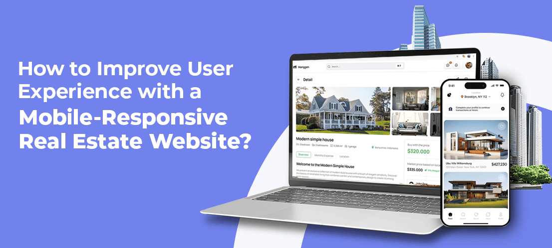
As real estate websites are often overpowered by advanced features and functionality, agents tend to miss one important aspect—mobile responsiveness. Agents can build a website using a real estate website builder or by hiring professional developers. The effectiveness of the website depends on its easy accessibility. With users migrating from the web to mobiles, it has become important to be mobile-ready while building a website.
This blog will discuss the role of mobile responsiveness in the success of a real estate website.
How Does a Mobile Responsive Website Look?
One common mistake many realtors are making is overlooking the need for cross-platform development. If your real estate auction website looks great on a laptop or desktop but fails to deliver the same experience on smartphones, chances are it will put off many potential clients. Before we move on to discuss what a mobile-responsive website looks like, let’s take a brief look at what can put off smartphone users.
Sarah, an established real estate agent based in San José, faced the crisis of a mobile-heavy website when she first started her digital journey. The graphics and media used on her website were not easily accessible on a smartphone. Her perfect-looking real estate website looked like a misaligned mess when a user tried to explore her listings on their phone. Her experience speaks for many realtors out there who didn’t consider mobile responsiveness at first. Common website-building mistakes look like this:
· Bulky Graphics and Media
· Non-Responsive Layouts
· Overloaded Navigation Menus
· Pop-ups and Overlays
· Small Clickable Areas (Buttons and Links)
· Not Optimizing for Mobile Speed
· Ignoring Mobile Form Optimization
· Lack of Testing on Multiple Devices
· Not Prioritizing Essential Content
· Over-reliance on Hover Effects
Committing any of the above mistakes can impact the mobile responsiveness of your website, affecting the user experience. To deliver the maximum user experience and produce translatable results from your real estate website, you must make more right than wrong.
Ensure Easy Navigation, Avoid Overload
Navigation should be simple and intuitive to keep unnecessary menus or links from cluttering the interface to make it better for mobile users. Use streamlined designs and essential features such as property listing and contact details, keeping users browsing easy without having too much information to process.
Optimize Graphics and Media
Big media files make a web page slow, especially on mobile devices. Hence, it becomes necessary to compress images and videos as much as possible without dropping the quality of those files. Not only do they load faster but designs and layouts get maintained irrespective of the screen size, which means cases of misplaced content do not happen.
Implement Responsive Design
A responsive design will ensure that the website accommodates itself to any given size of the screen, whether it is a desktop or a smartphone. Such adaptability ensures that the structure and text or images remain perfectly scaled and aligned on mobile phones for an optimal browsing experience. The website, developed with responsive design, works equally well for all the devices.
Prioritize Touch-Friendly Features
Users of mobile devices mainly interact on the website through touch. To make it more user-friendly, buttons and links must be large enough for tapping; otherwise, there must be enough space between, them so they don’t accidentally click on another. Thus, making it accessible and easy to navigate on the site causes an overall increase in customer satisfaction.
Test Across Devices
Make your real estate website cross-browser and cross-mobile device compatible without a glitch. Test your website on various popular devices, such as iPhones and Android phones and tablets, to find problematic functionality or layout-related issues. This means all your users will end up getting a smooth browsing experience regardless of the device they use.
Avoid Intrusive Pop-ups
Pop-ups are annoying and not so much fun on mobile screens. Keep the pop-ups minimal and ensure they can easily be closed. Overly intrusive pop-ups usually drive a frustrated user away and may also contribute towards increased bounce rates. Use pop-ups very sparingly only if providing some vital information, such as notifications or alerts.
Prioritize Essential Content
Mobile users will search for just the kind of information they are looking for, such as listings and contact information. In addition to this, the top or most important content must be accessible and readable from that smaller screen. The essentials are what you should focus on to make that mobile interface better and help find the desired information for users as fast as possible.
Use Mobile-Friendly Typeface
Choosing the right kind of font is essential for mobile readability. Only clear, legible fonts and the right size should be used for easy readability on smaller screens. Avoid fonts that are too decorative or too thin because they might be hard to read on a phone. Appropriate spacing plus adequate contrast between the text and its background enhance readability and the general user experience in total.
How to Test Your Website for Mobile Responsiveness?
There are a couple of ways to test your real estate website for mobile responsiveness. The easiest way to check the mobile responsiveness of your website is through Google Chrome’s on-page inspection tool. It’s easy to visualize your website in mobile view using this tool and get a quick assessment just by following some simple steps.
1. Right-click anywhere on your website and click on inspect.
2. Find the toggle device toolbar on the left side of the developer tool panel and click it.
3. You can now see your real estate website on a mobile screen. Chrome will let you know if your website is responsive or not.
Another way to assess your website for mobile responsiveness is by partnering with a reliable real estate website builder. When you trust an expert listing management platform like BidHom with your website, you get a mobile-responsive real estate website that enhances your chances of generating more business and delivering a top-notch user experience.
BidHom has got your back!
BidHom is a leading real estate website builder and online auction platform, helping realtors across the globe with efficient listing, offer, auction, and transaction management. By following some simple steps, you can set up a mobile responsive website for your business without having to worry about any blind spots.
Cherry on top, BidHom is a cost-effective website builder and real estate auction platform, powered with IDX and MLS integration and real-time analytics. Realtors who do not want to get into the technicalities of website development and optimization can rely on BidHom for a high-end and user-friendly website. Why wait? Start building your website today.


Share Article